Case Study 03
Otherkind Website Redesign
Redesigned a mental health website to feel credible, calm, and actionable for high-functioning adults.
How do you redesign a mental health website without creating more emotional overwhelm?
Role
End-to-End Product Designer
UX/UI Design · Web Design · Design System
Timeline & Status
Live product
Outcome
Consultation bookings increased 62% in the first month after launch
Overview
Designing for clarity without emotional overwhelm
Otherkind is a mental health practice focused on anxiety therapy for high-functioning adults.
While the original website communicated clinical credibility, the experience felt dense and cognitively demanding, especially for users already navigating stress, burnout, or anxiety.
The goal was not to add more information, but to reduce friction, cognitive load, and emotional resistance while preserving clinical trust and professionalism.
Context
When credibility alone isn’t enough
Mental health products exist in a sensitive space. Users arrive with hesitation, skepticism, and emotional fatigue.
Early feedback and internal discussions revealed that while Otherkind’s approach was effective, the website experience felt overwhelming for first-time visitors.
The challenge was not the therapy model itself, but how quickly users could understand it, trust it, and take action.
My Role
Understanding the audience’s mental state
I approached the redesign by focusing on:
- The emotional state of first-time visitors
- Moments of hesitation or disengagement
- How much information is necessary to build trust without overload
Rather than benchmarking only against competitors, I studied patterns in high-trust healthcare and wellness products, especially how they balance reassurance, authority, and simplicity.
Our goal was to make it clear, minimal, and to the point with better UX writing.
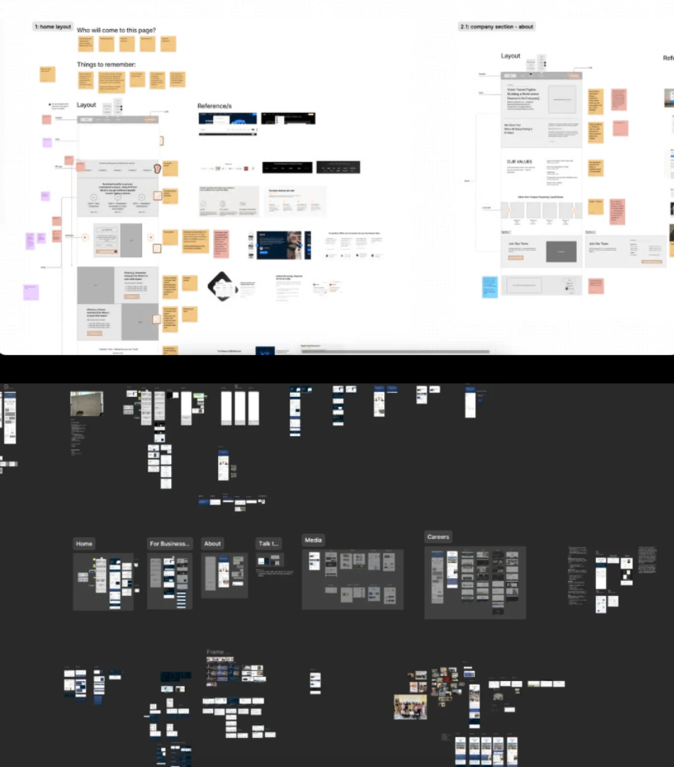
Ideation
Designing for emotional pacing
Working closely with the founder, we aligned on a core principle: every screen should answer one question, then get out of the way.
This led to:
- Clear information hierarchy
- Short, purposeful content blocks
- Strong emphasis on spacing, rhythm, and visual calm
Navigation and page structure were refined so users could quickly understand who this is for, how it works, and what to do next without feeling pushed.
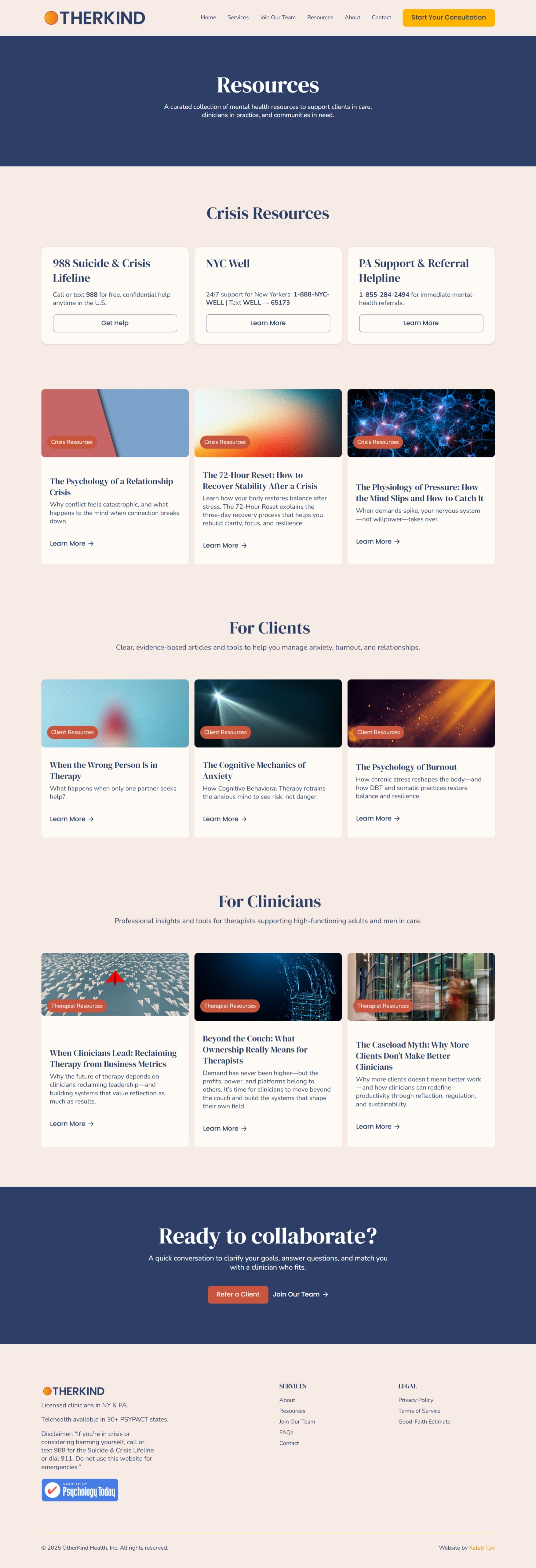
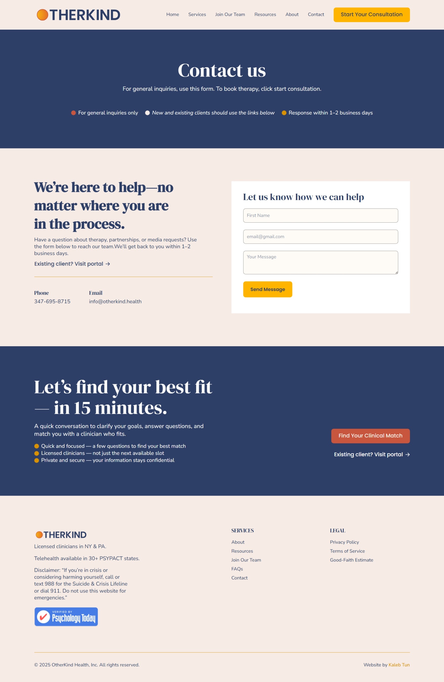
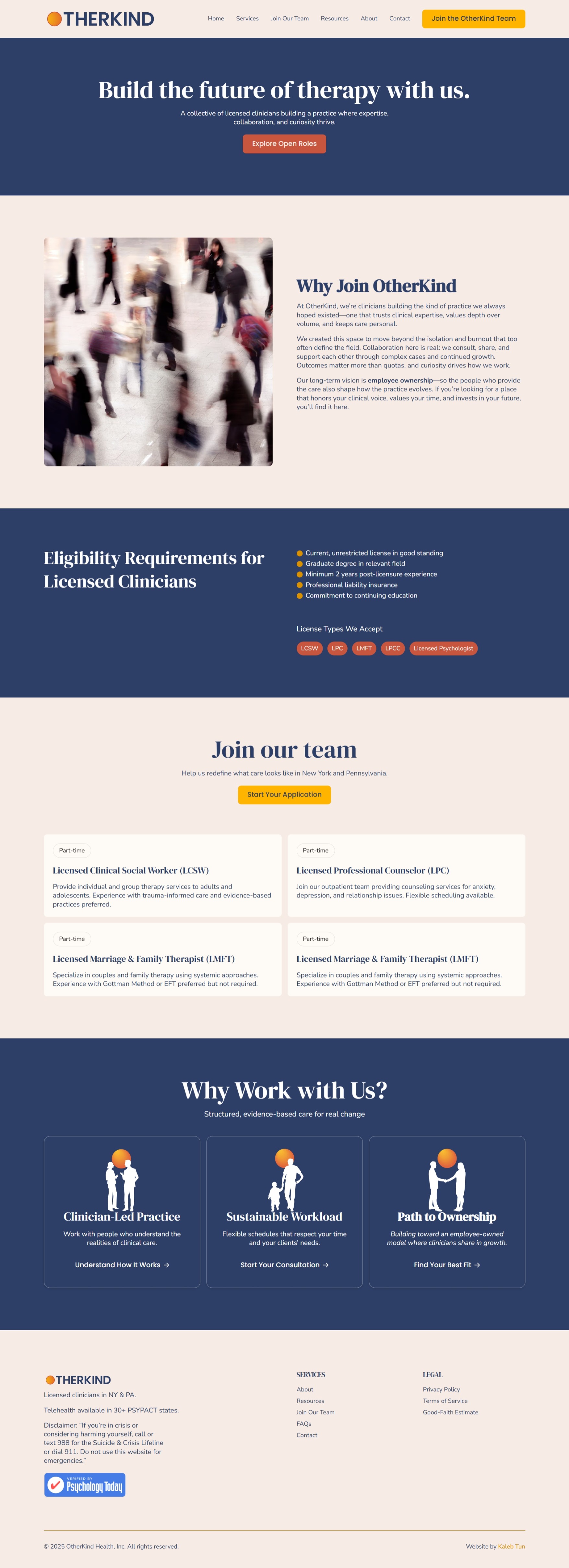
Design
Calm, confidence, and control translated visually
The visual direction prioritized restraint over decoration.
Key design decisions included:
- A warm but neutral color palette to reduce emotional intensity
- Typography that balances approachability with professionalism
- Minimal interface elements to keep attention on content
- Clear CTAs placed only where user intent is highest
Imagery was used deliberately, not as filler, but to support emotional grounding. Layouts were iterated multiple times based on feedback, ensuring alignment between clinical accuracy, brand tone, and user experience.
Handoff & Implementation
Design files were structured for clarity and ease of implementation. Components, spacing rules, and layout patterns were documented to support consistent iteration as the product evolved.
Close collaboration with the team ensured the final experience matched both the design intent and technical constraints.
Results
A calmer first interaction.
The redesigned website is now live at otherkind.health.
The outcome is a clearer, more grounded experience that:
- Feels less overwhelming for first-time visitors
- Communicates credibility without clinical heaviness
- Helps users move from hesitation to action more confidently
Internal feedback highlighted improved clarity, tone, and overall trust in the product’s first impression.
Consultation bookings increased 62% in the first month after launch.