Case Study 01
Deep Trace
AI-powered anti-counterfeit verification product redesign.
How do you make a complex AI verification process easy enough for users to complete and trust?
Role
End-to-End Product Designer
Brand · Product · UX Research · UI
Timeline & Status
Live product · Ongoing iterations
Recognition
Innovation Award 2025
Overview
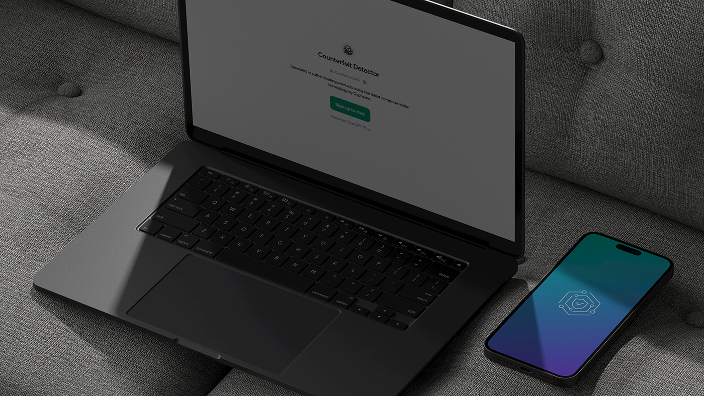
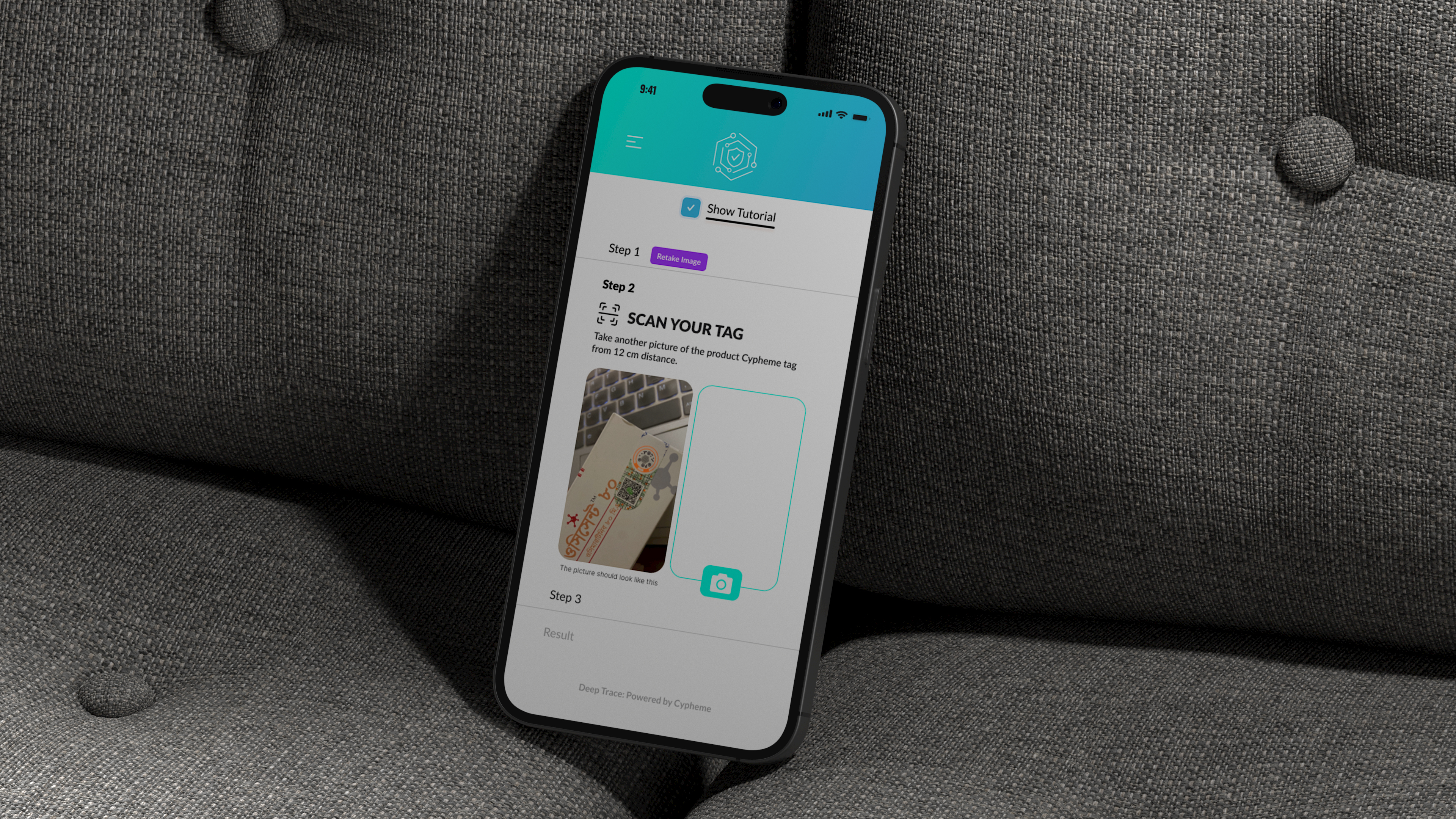
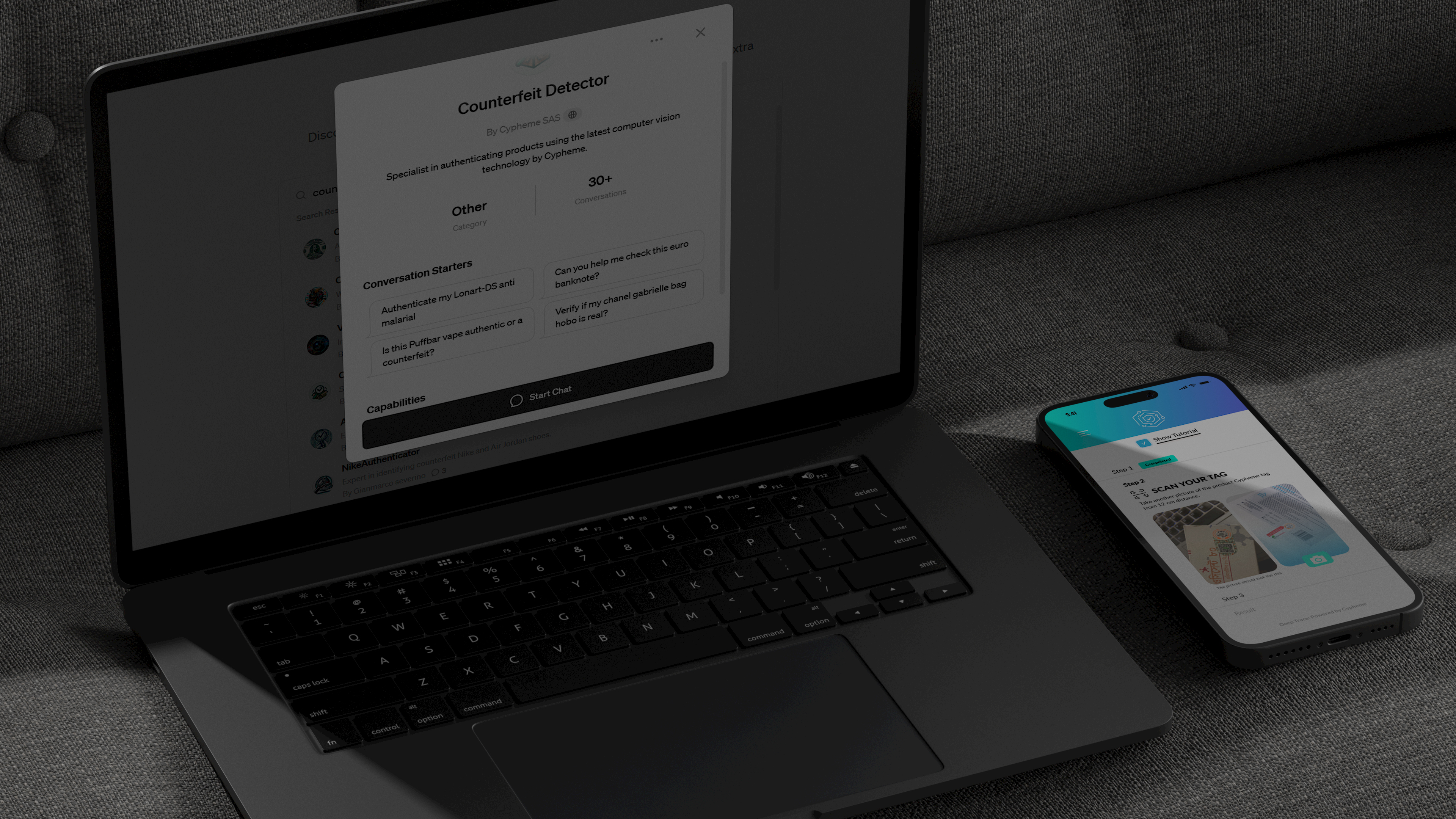
Deep Trace is an AI-powered anti-counterfeit product designed to verify the authenticity of physical goods using a smartphone camera.
It enables consumers and businesses to distinguish genuine products from counterfeits by analyzing visual patterns in product packaging, without requiring specialized hardware.
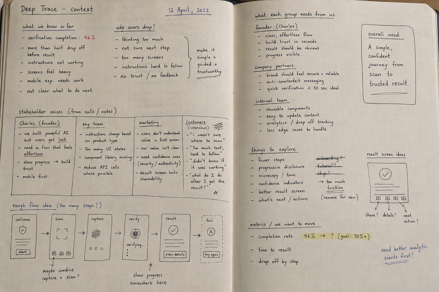
When I joined the product, one of the main challenges was not the AI technology itself, but getting users successfully through the verification journey. Only 46% of users who started the process were completing it.
My work focused on understanding where users were leaving, simplifying the verification flow, testing changes, and gradually improving the experience. Following the redesign and ongoing iterations, verification completion increased from 46% to 72%.
The product has been applied across healthcare, consumer goods, and the vape industry, and received the Best Innovation Award at the Vapouround Global Awards 2025.
Context
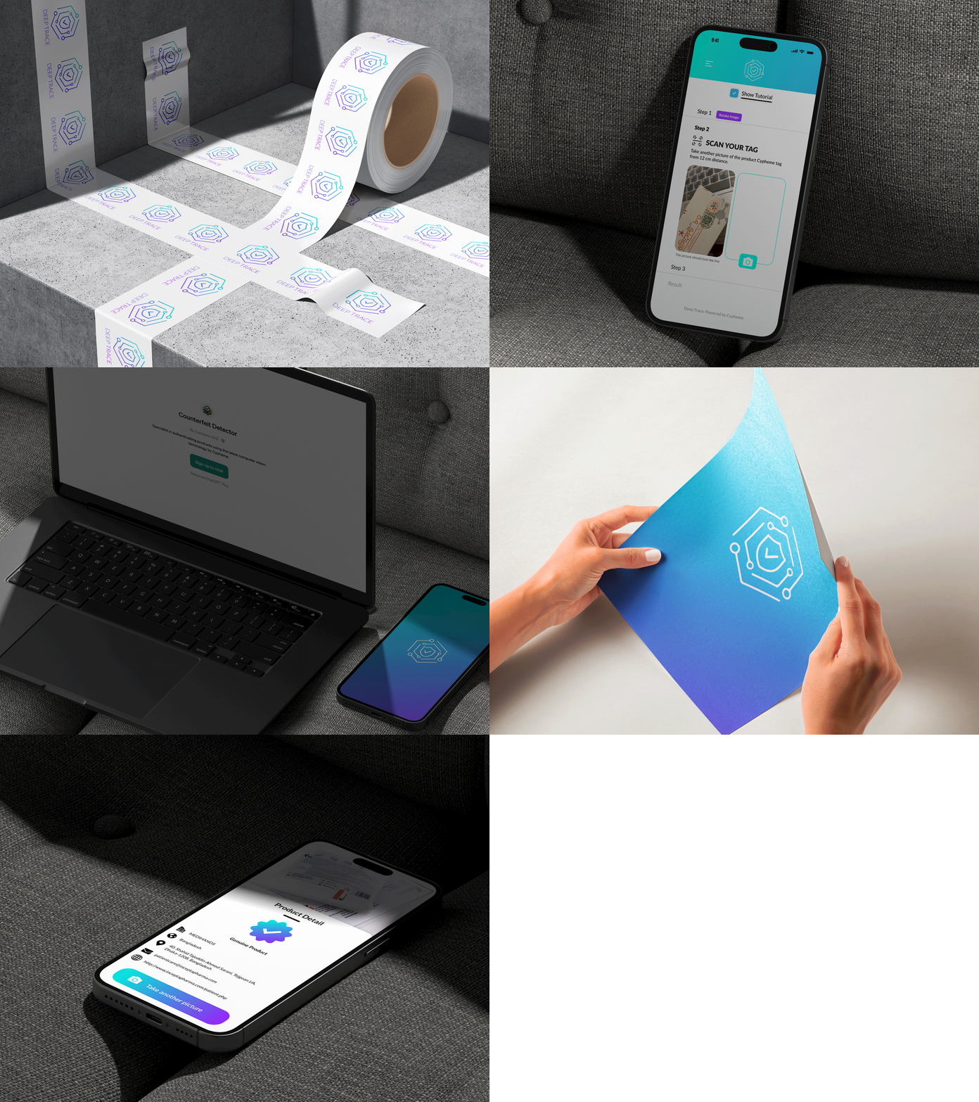
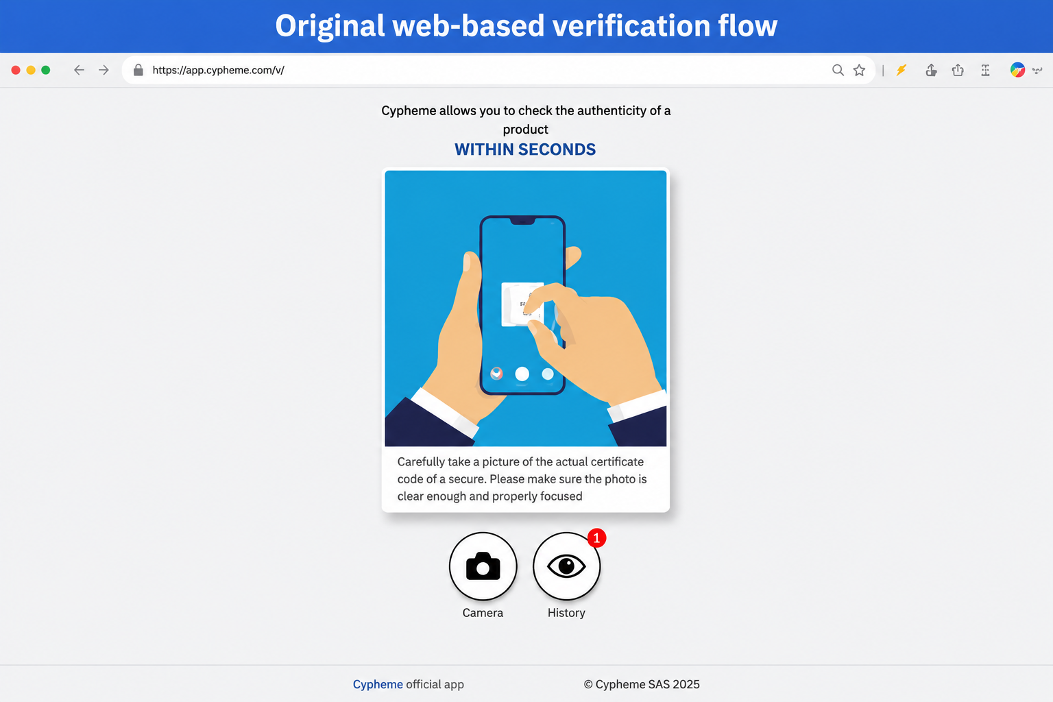
The original Deep Trace product was web-based and highly functional, but difficult to navigate. The interface was visually plain, overloaded with information, and lacked a cohesive brand or design system.
More importantly, product data showed that users were dropping out during verification. Only 46% of people who started the journey were reaching the end.
Users had to interpret complex instructions while trying to position and scan a physical product correctly. Important actions competed with secondary information, and the interface did not always make it clear what the user should do next.
For a product built to reduce doubt, the experience itself was introducing friction. The challenge became less about redesigning individual screens and more about understanding why people were leaving the journey and what would help them finish it.
The Problem
- Verification completion was only 46%
- Users were leaving at different points of the verification journey
- Instructions required too much attention during a simple task
- Overloaded screens created unnecessary cognitive load
- Navigation and next actions were not always clear
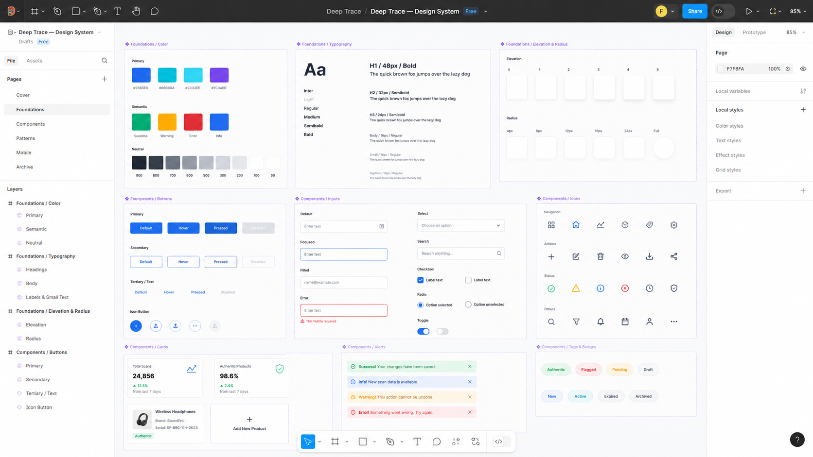
- There was no consistent visual language or design system
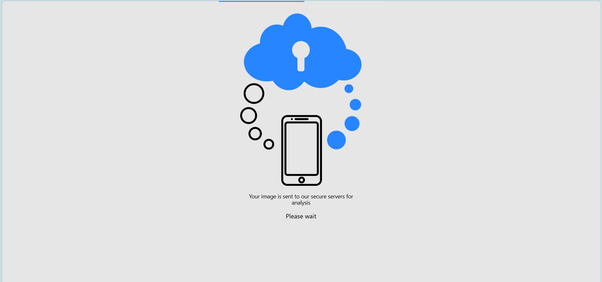
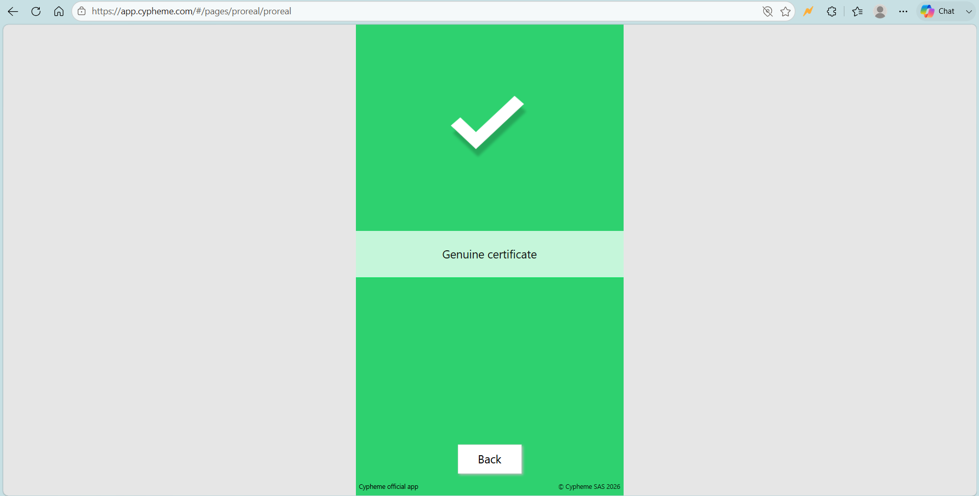
- System and error states needed clearer feedback and recovery
Users didn't need more information. They needed clarity, guidance, and confidence to finish the task.
My Role
End-to-End Product Designer
I owned the experience from understanding the problem through design, testing, release, and iteration.
- Analyzed the existing verification journey and drop-off points
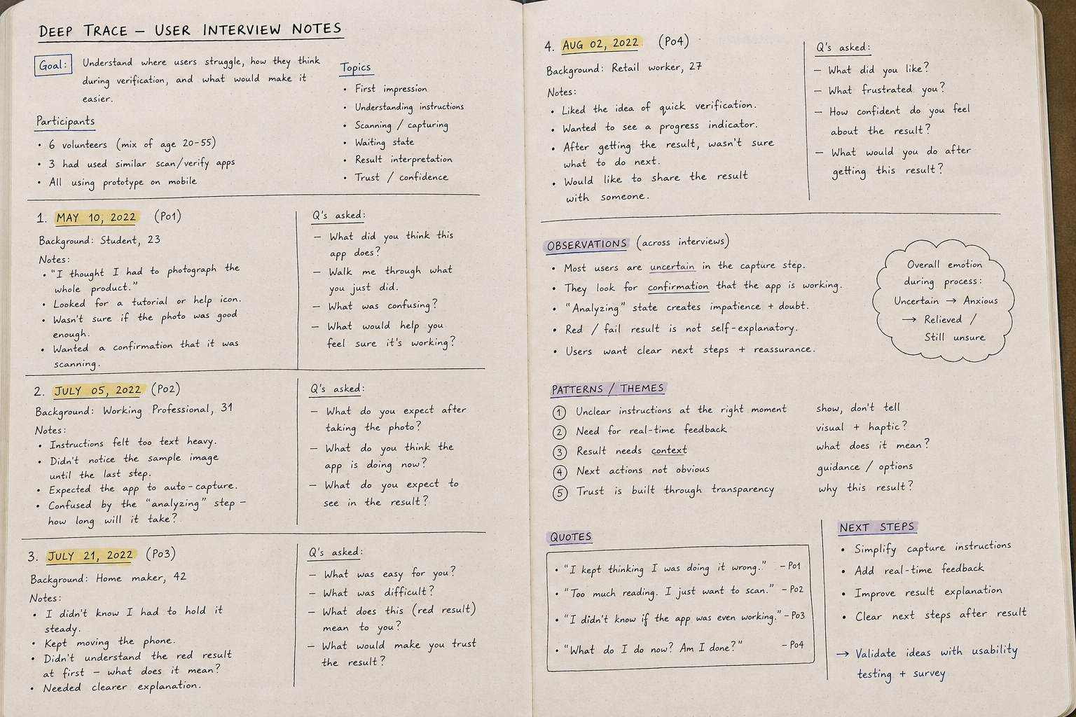
- Conducted user and stakeholder research
- Created and tested wireframes and interactive prototypes
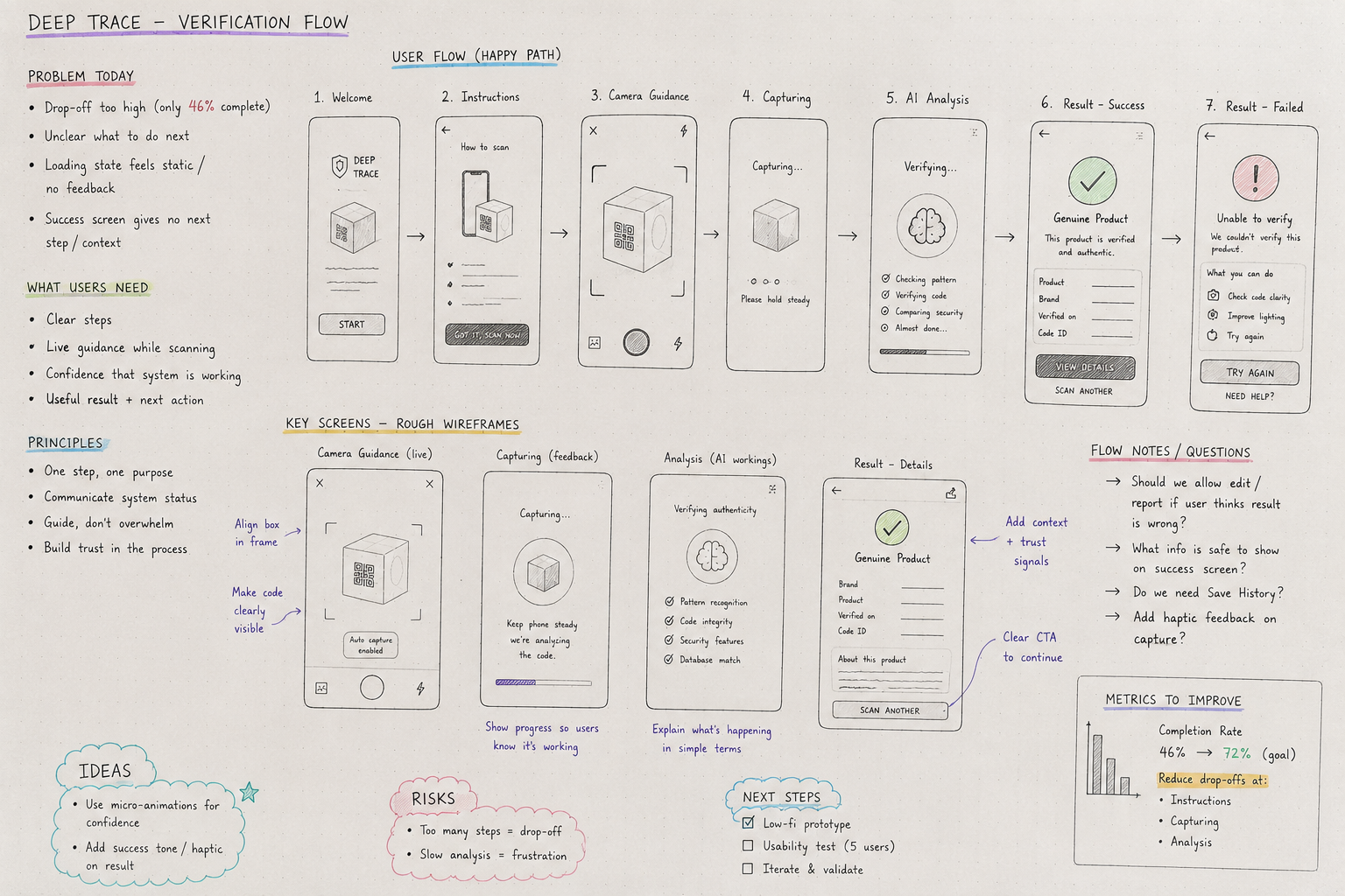
- Reworked the verification flow into clear, step-by-step interactions
- Designed UI, UX writing, and interaction patterns
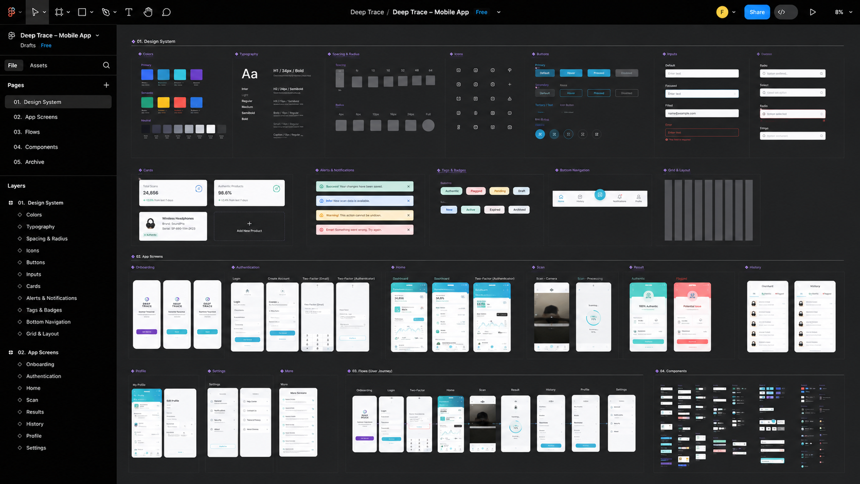
- Built the visual language and reusable design system
- Worked closely with engineering during implementation
- Used feedback and product data to guide later iterations
- Designed the product experience across web and mobile
I worked directly with the co-founder of Cypheme, Charles Gracia, as well as the development and marketing teams. This was important because the product was used across different industries and customer contexts while the experience still needed to remain simple and consistent.
Research, Testing & Iteration
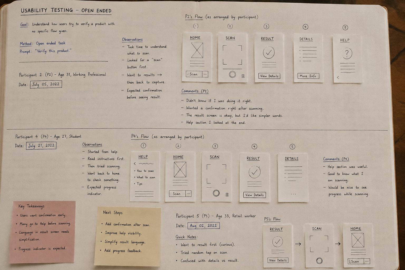
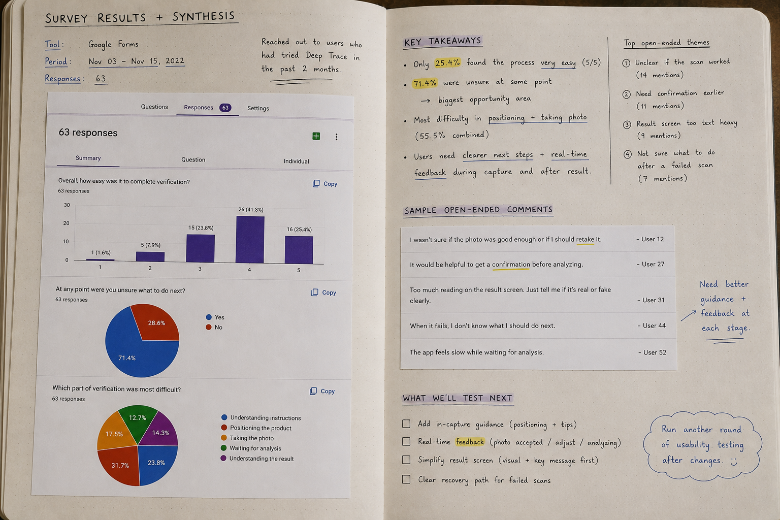
The completion rate showed us what was happening, but research was needed to understand why.
I combined qualitative feedback with behavioral data rather than relying on one source. I reviewed the existing verification funnel to understand where people were leaving and compared that with feedback from users and stakeholders.
Stakeholder conversations with the co-founder, engineering, and marketing teams helped uncover technical limitations, common customer questions, and the different ways the product was being used.
User feedback and surveys helped us understand where instructions felt unclear, what users expected during verification, and where additional guidance was needed.
I also used usability testing with prototypes to observe whether users could move through important verification tasks without additional explanation. I looked for hesitation, misunderstood instructions, failed attempts, and uncertainty around what to do next.
What we measured
- Verification task completion
- Drop-off across important steps
- Failed attempts and retries
- Progress through the verification funnel
- User feedback and recurring usability issues
- Behavior before and after interaction changes
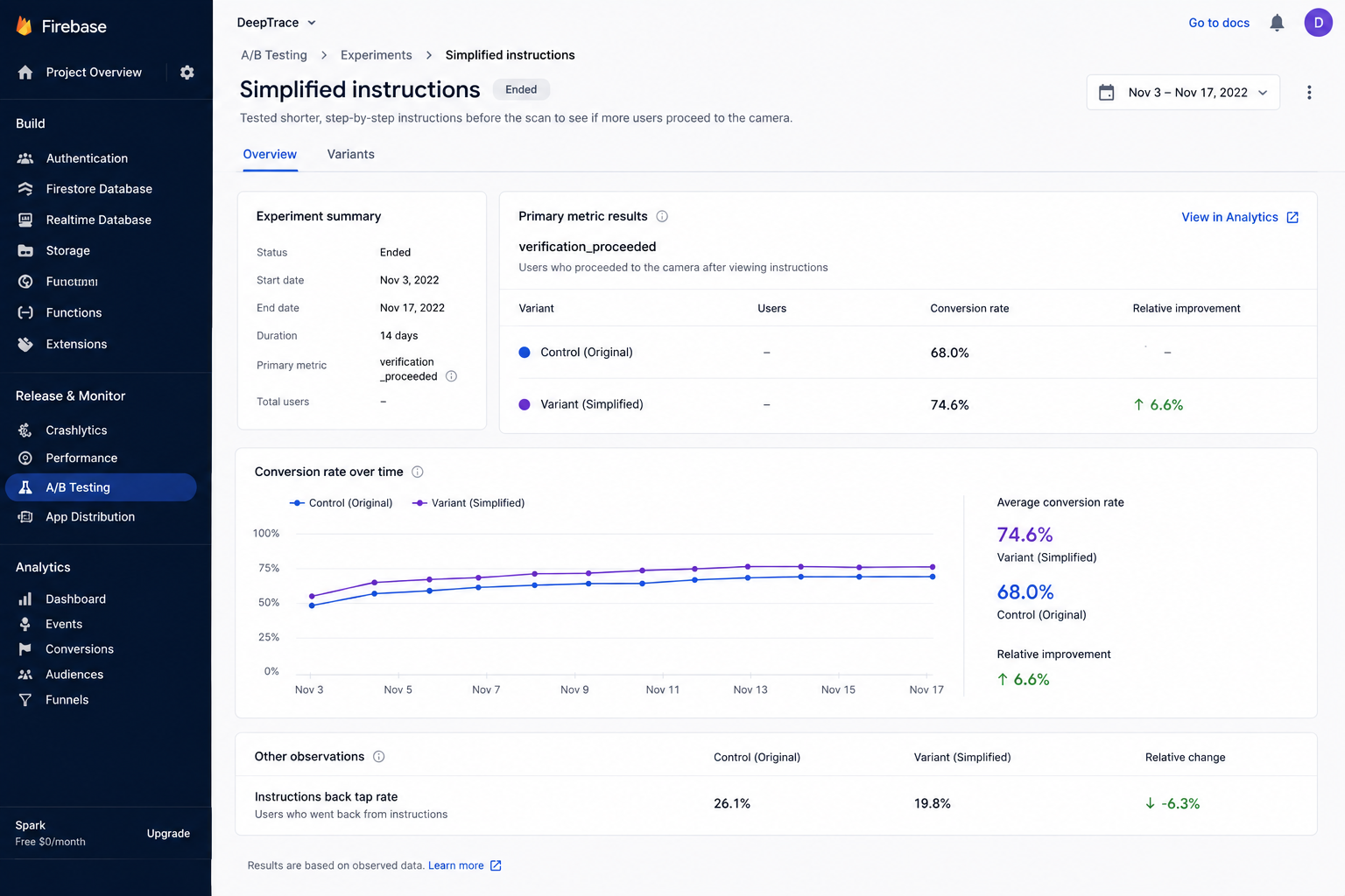
Rather than treating the redesign as one large release, important changes were tested and introduced gradually. Different approaches to instructions, actions, and verification steps were compared before committing to the final interaction.
Where appropriate, controlled A/B testing and staged releases helped us understand whether a change was improving real user behavior.
Research → Prototype → Test → Release → Measure → Refine
The Approach
Designing for clarity, not complexity.
Research pointed toward a simple idea: users did not need to understand everything happening behind the AI. They needed to understand what the system expected from them at each moment.
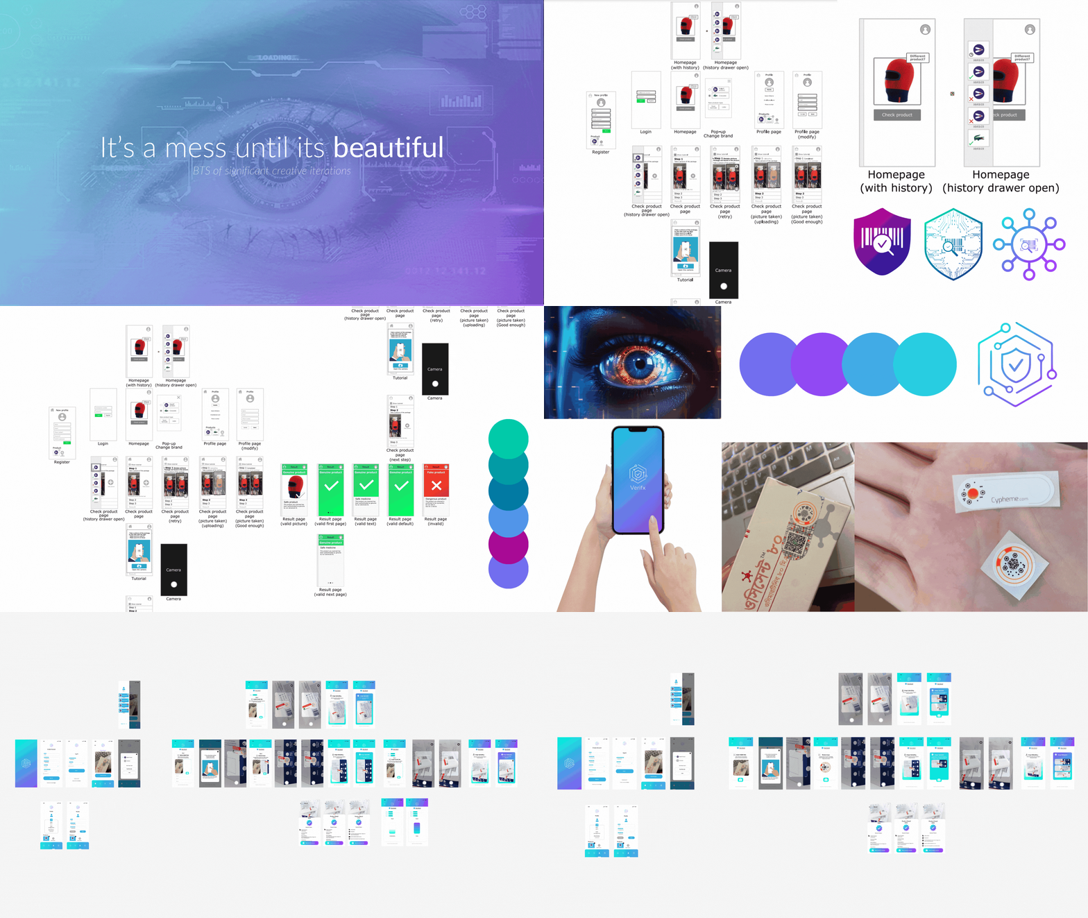
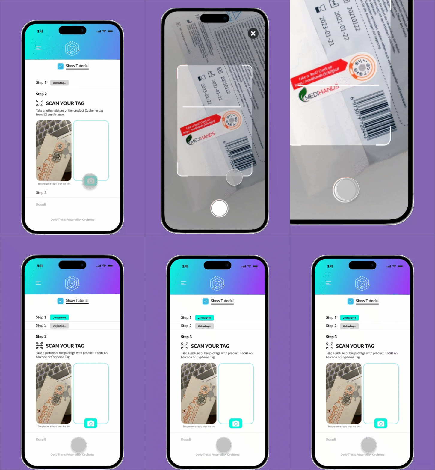
I redesigned the verification journey into smaller guided steps, with each screen focused on one purpose and one clear action.
Instead of presenting instructions upfront, information was shown when it became relevant. Camera guidance supported the user during capture, system states communicated when analysis was taking place, and results were separated clearly from the scanning process.
I also paid particular attention to failure and retry states. An unsuccessful scan should not feel like a dead end. The interface needed to explain what happened and help the user understand what to do next.
The visual interface was stripped down to essentials and supported by clear microcopy, deliberate spacing, and a consistent hierarchy. Primary actions remained visually distinct so users could quickly understand where their attention was required.
This thinking also informed the design system. Components were designed around reusable states such as actions, loading, analysis, success, warning, and failure so the experience remained consistent as the product continued to grow.
Reduce uncertainty, make the next action obvious, and help more users successfully complete verification.
Outcome
The redesigned Deep Trace experience transformed a technically complex verification process into a clearer and more guided journey.
Before
46%
Verification completion
After
72%
Verification completion
The percentage of users who started and completed the verification journey increased by 26 percentage points following the redesign and subsequent iterations.
- Higher verification task completion
- Lower drop-off across the verification journey
- Clearer step-by-step interactions
- Better guidance around AI processing and verification states
- More useful recovery paths when verification could not be completed
- Reduced cognitive load through simpler UI and UX writing
- A cohesive design system across platforms
- Stronger collaboration between product, marketing, and engineering
The wider Deep Trace product continued to grow across multiple industries and received the Best Innovation Award at the Vapouround Global Awards 2025.
Cypheme reports that its technology has stopped 10 million fake products, helped save 6,000 lives, and recovered $150 million in revenue.
What I took from the project
Deep Trace changed how I think about AI experiences. Product data can tell you where people are struggling, but research helps explain why. With AI products in particular, successful UX is not about explaining every part of the technology. It is about giving users enough information to understand what is happening, what they need to do, and what they can do when something goes wrong.
That combination of research, testing, product data, and continuous iteration became a much bigger part of how I approached later products.