Case Study 02
Cypheme Enterprise Admin Platform
Redesigning a B2B SaaS admin platform for product authentication, scan analytics, dynamic landing pages, and enterprise verification workflows.
Overview
Cypheme is an AI-powered anti-counterfeit and product authentication platform that helps brands protect products, verify authenticity, and track product interactions globally.
The enterprise admin platform allows B2B brands to manage authentication landing pages, monitor scan activity, track geographic product interactions, and create branded verification experiences connected to QR codes, NFC tags, and serialized product identifiers.
My role was to redesign and modernize the admin experience so the platform could feel clearer, more scalable, and more enterprise-ready.
The Challenge
The original system contained powerful functionality, but the experience had become visually outdated, fragmented, and difficult to scale.
Analytics were split across disconnected views, forms were visually heavy, and users had to work through cluttered interfaces to manage content, scan data, and product verification pages.
The platform had enterprise functionality, but the interface did not yet communicate enterprise confidence.
Redesign Goals
- Reduce cognitive load across dense admin workflows
- Improve analytics visibility and scan activity comprehension
- Modernize the dashboard into a SaaS-ready enterprise experience
- Create modular landing page creation flows for non-technical users
- Support multilingual and product-specific verification pages
- Introduce stronger authentication and security UX patterns
- Create reusable UI patterns for long-term scalability
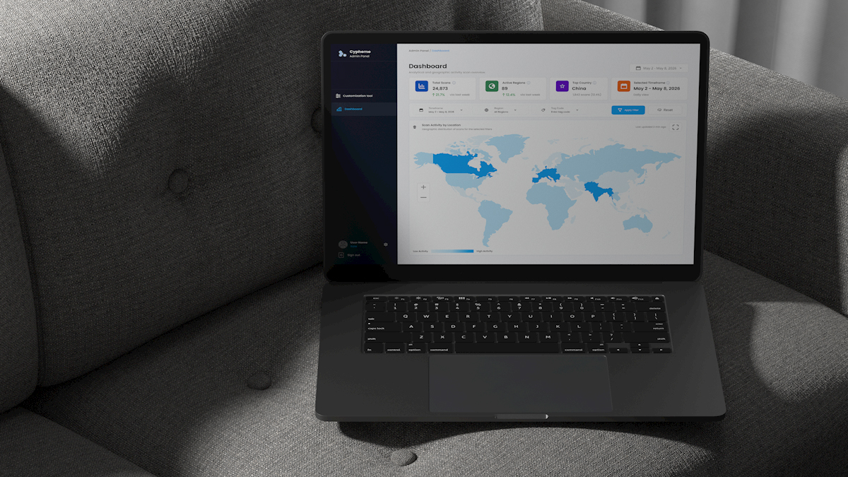
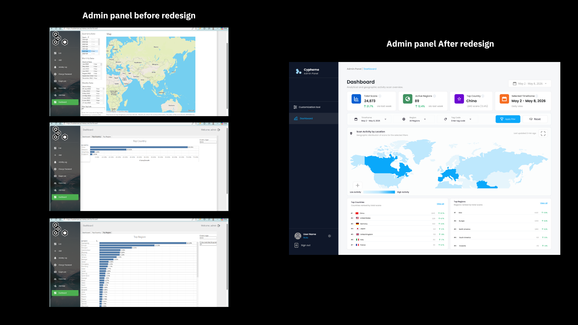
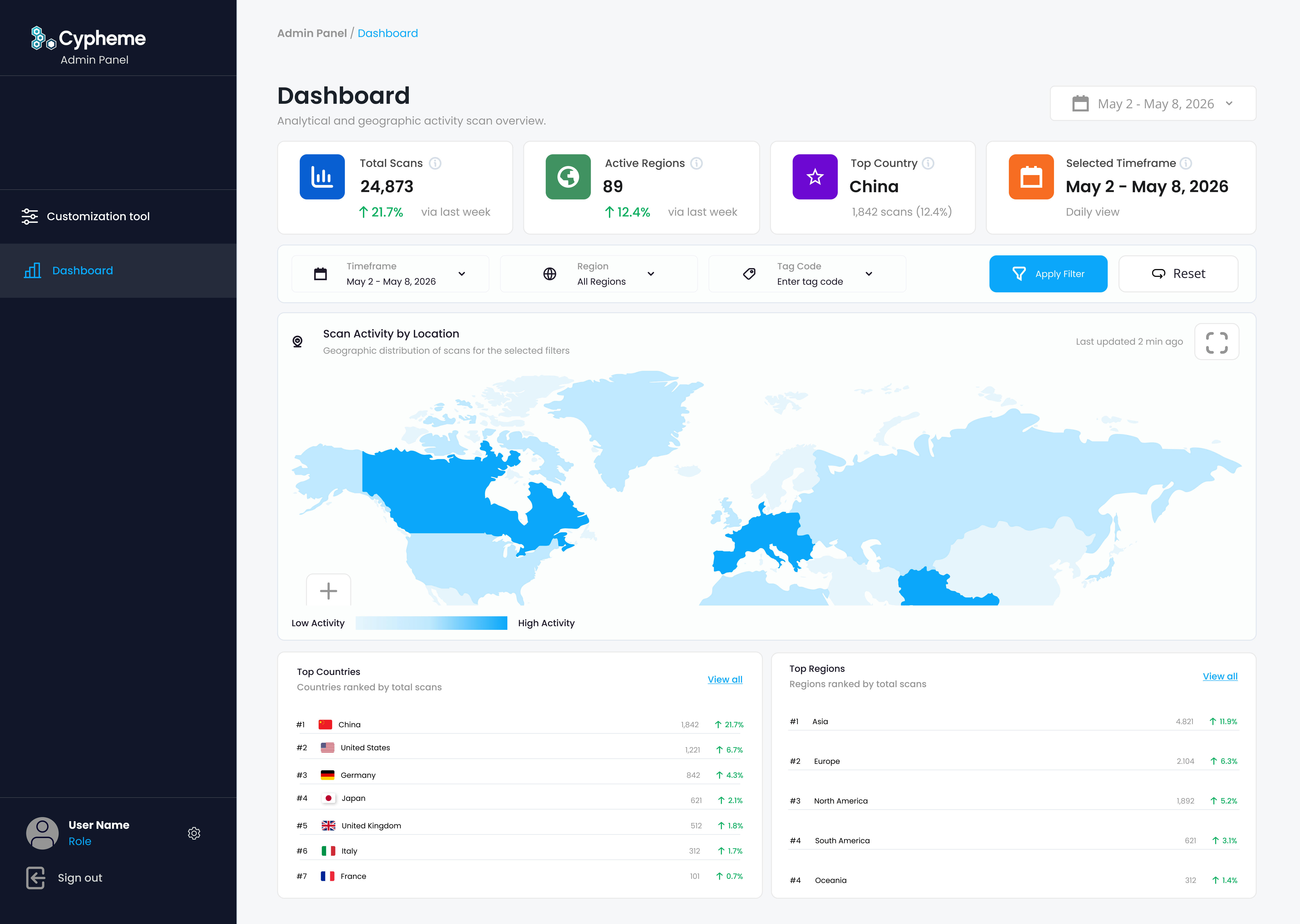
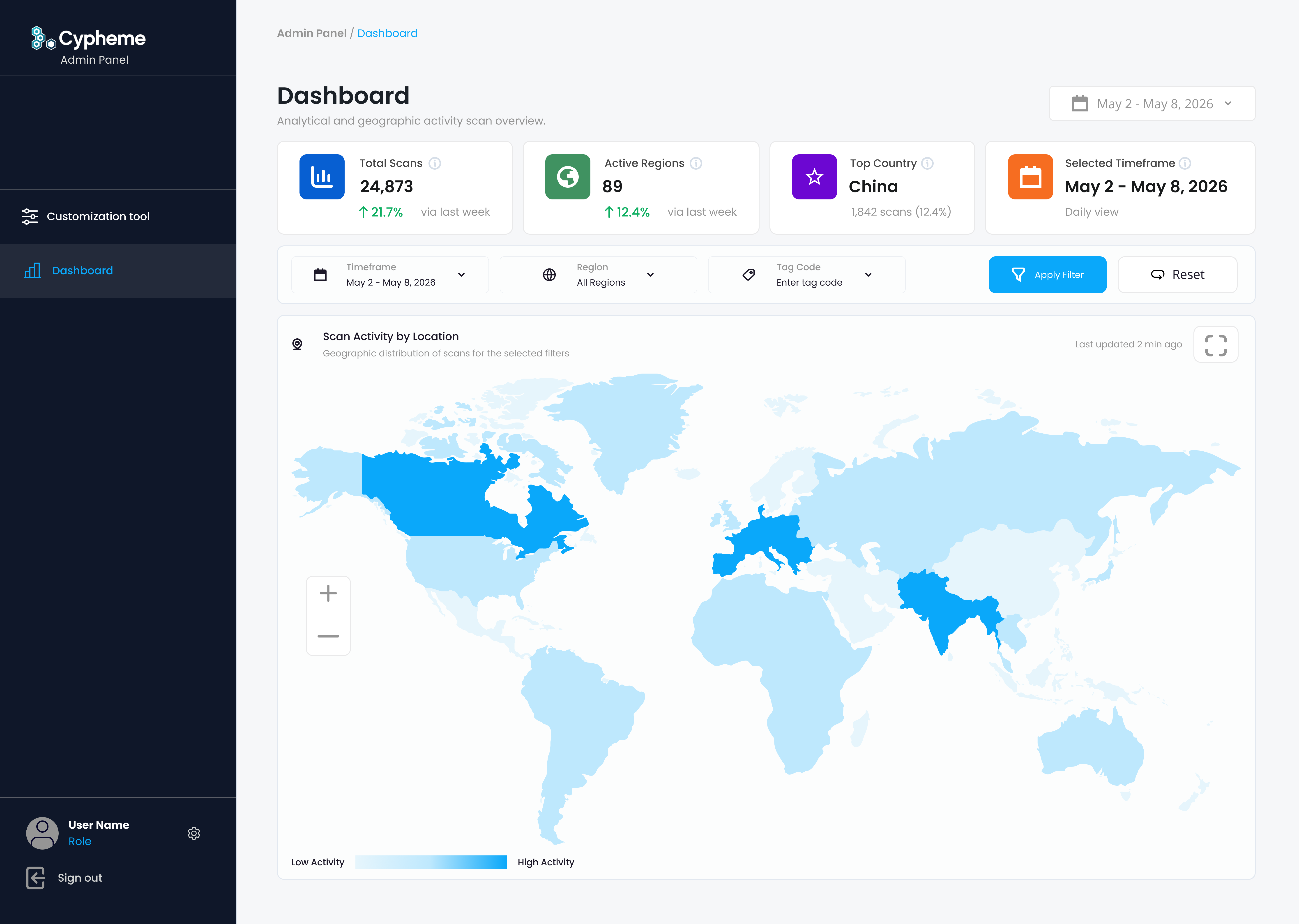
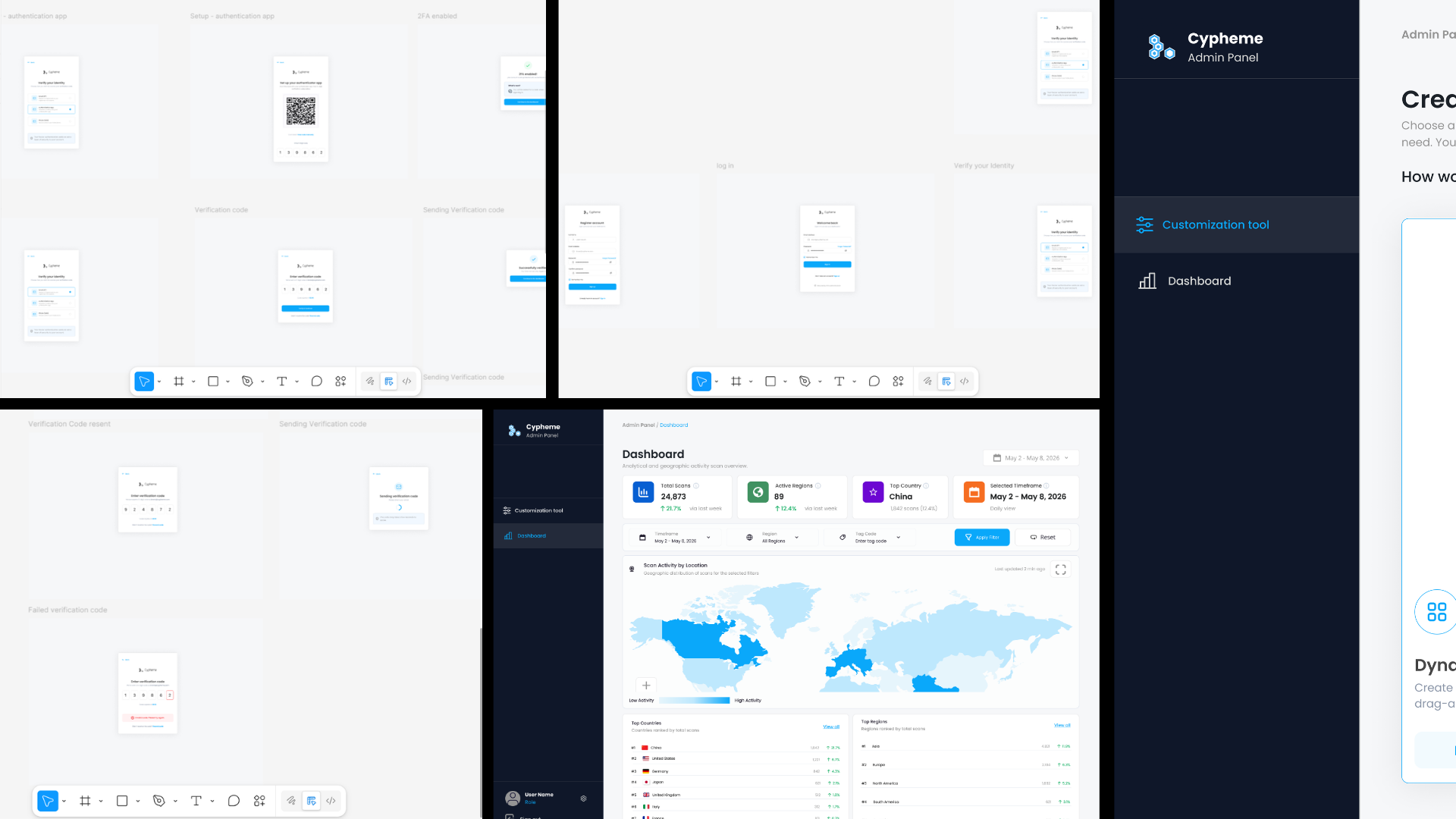
Dashboard Redesign
The old dashboard relied heavily on large maps, dense filters, and disconnected country or region tables. Important data existed, but users had to work too hard to understand it.
The redesigned dashboard introduced KPI overview cards, unified analytics, geographic scan visualization, clearer filter controls, ranked country and region tables, and a more structured visual hierarchy.
The goal was to help brand teams understand global product activity instantly instead of navigating through multiple fragmented views.
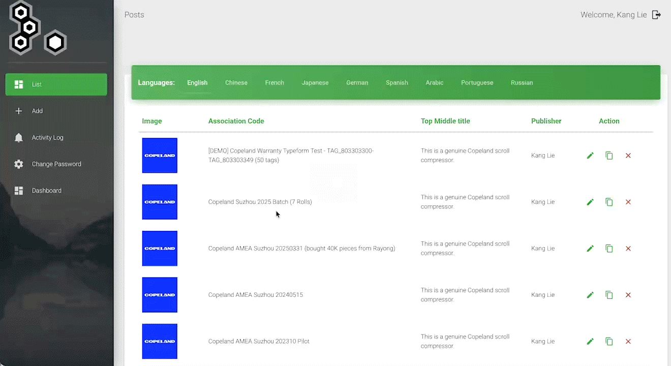
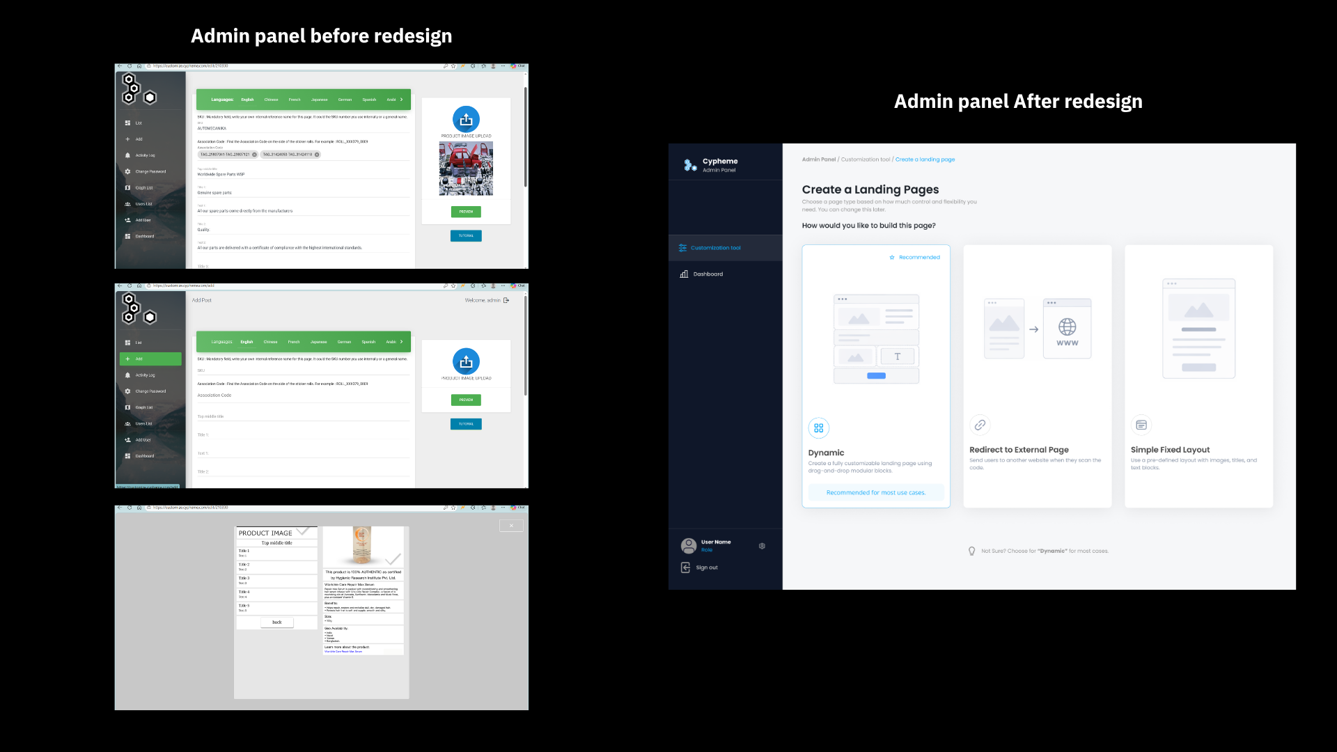
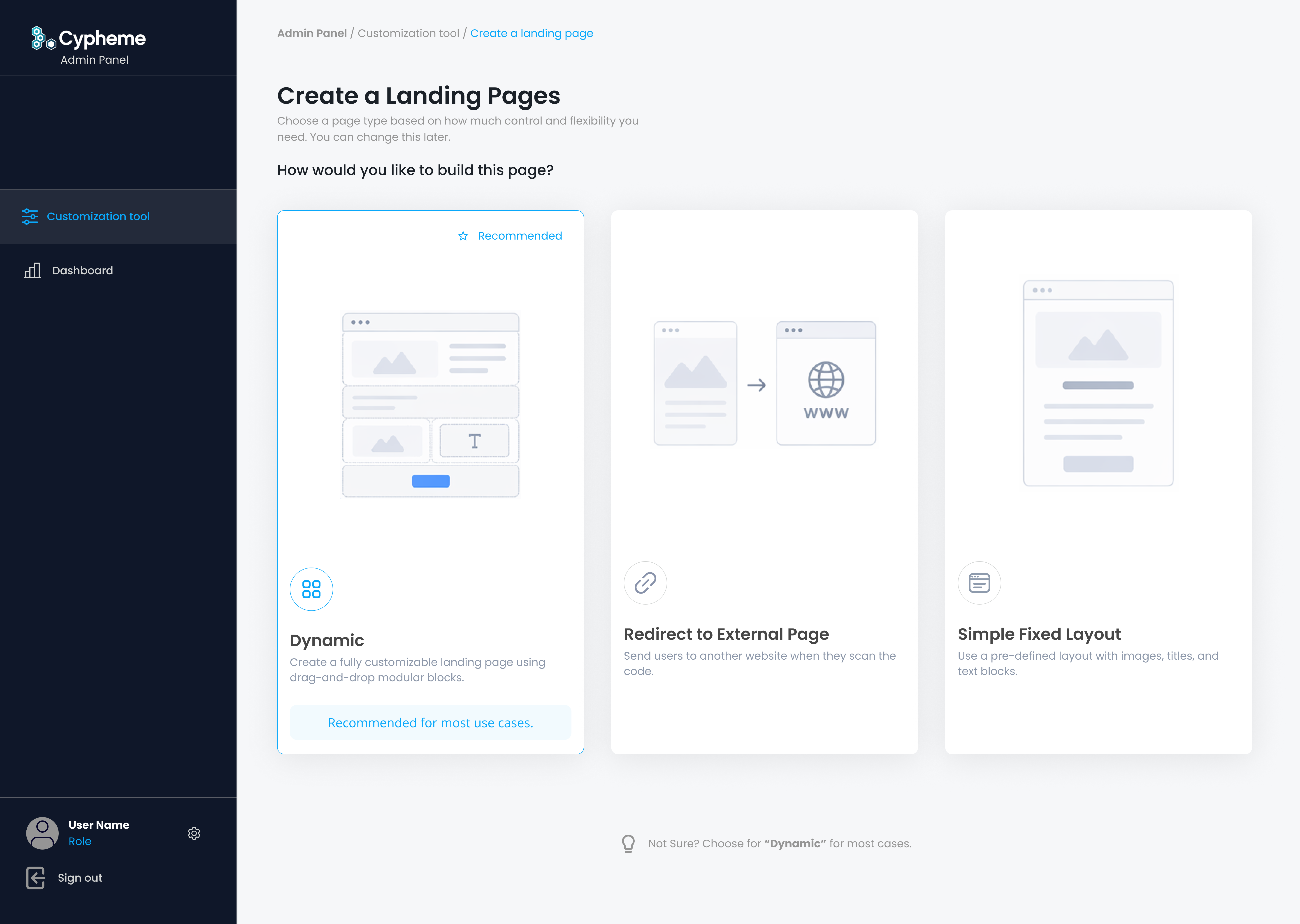
Dynamic Landing Page Builder
One of the most important redesign areas was the landing page creation system. The previous system depended on long forms and rigid layouts, making it difficult for non-technical users to confidently create branded verification pages.
The redesigned builder introduced a modular system where users could choose between dynamic pages, redirect pages, and simple fixed layouts depending on their use case.
This gave brand teams more flexibility while keeping the workflow understandable and scalable.
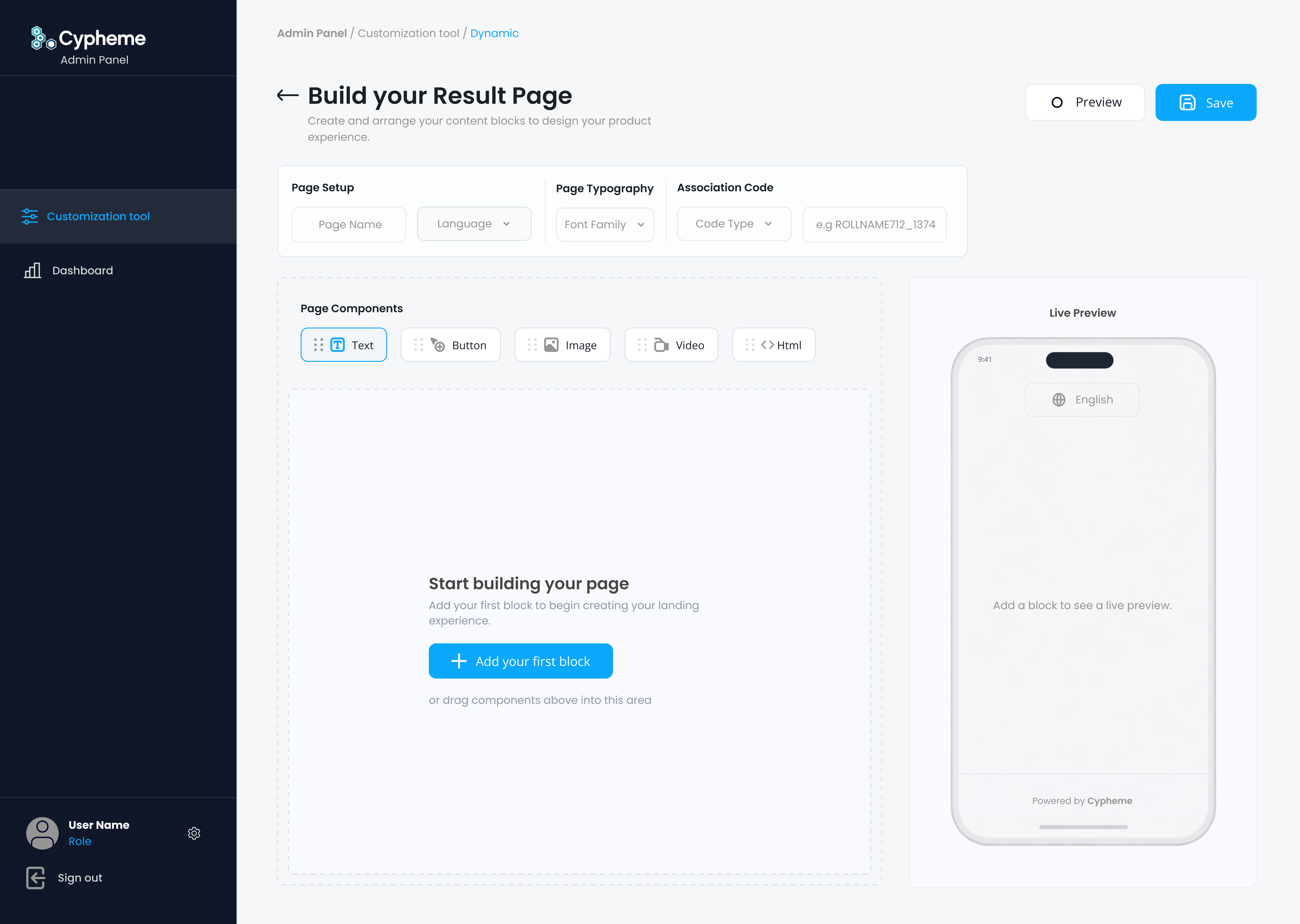
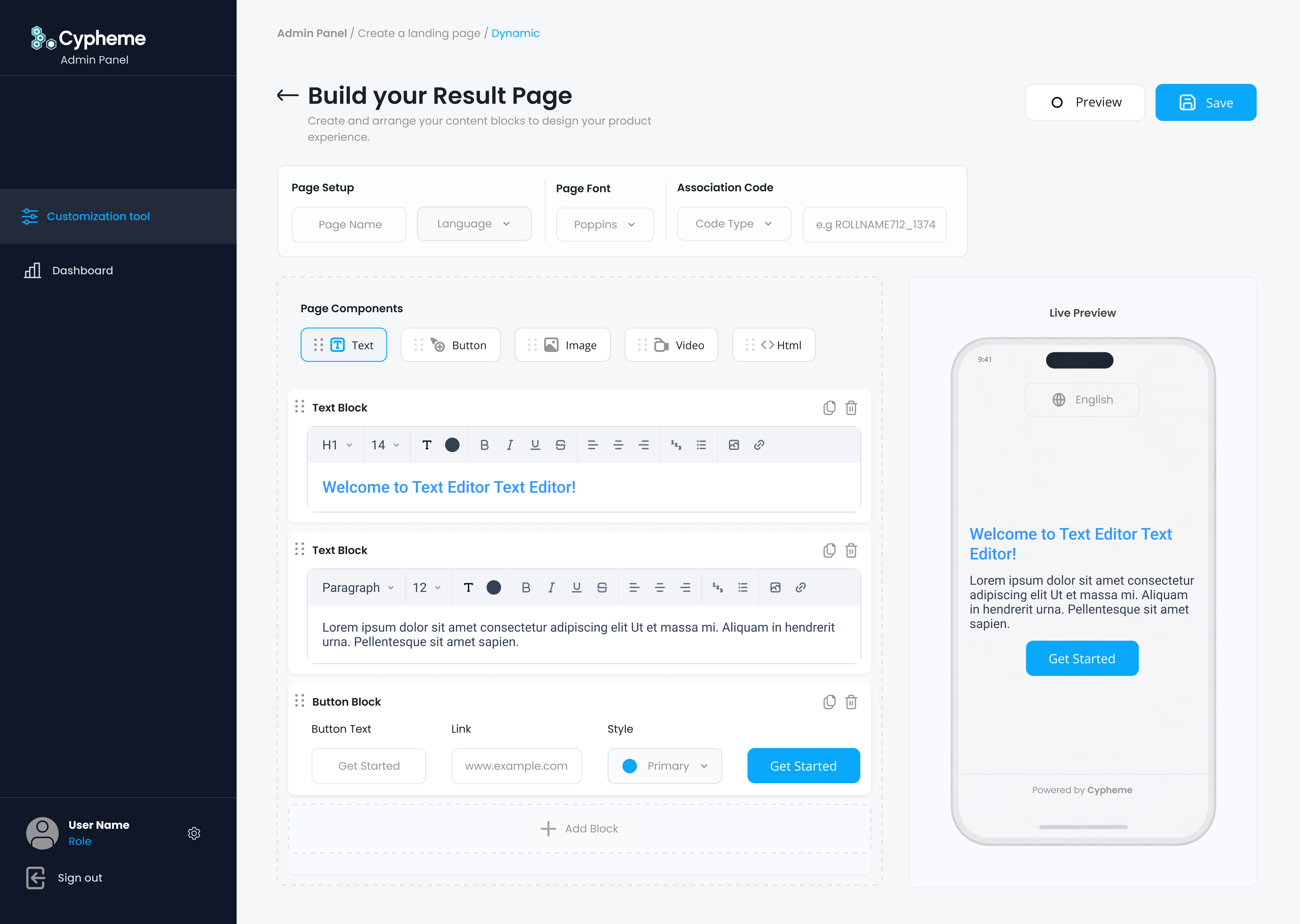
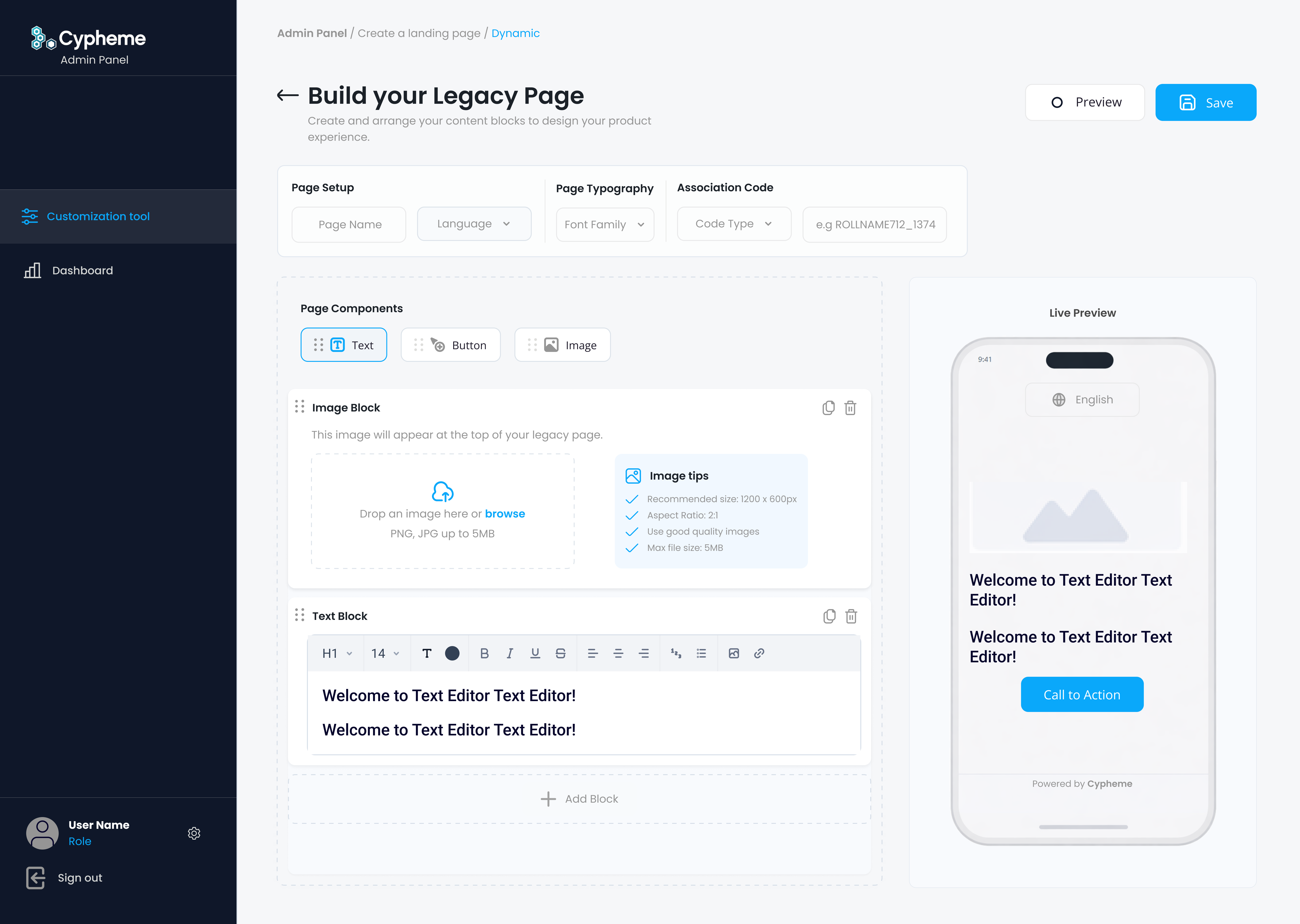
Mobile Preview & Page Creation
A live mobile preview was added directly into the page builder so users could understand how verification content would appear to customers after scanning a physical product.
This reduced guesswork, improved layout confidence, and made the system easier for non-technical teams managing product-specific or campaign-specific verification pages.
The editor became less about filling forms and more about shaping a real customer-facing verification experience.
Authentication & Security
As enterprise expectations increased, stronger account protection became an important part of the platform experience.
I designed authentication states for SMS verification, email verification, authenticator app setup, verification codes, resend flows, failed code states, and successful confirmation screens.
The goal was to make security feel structured and reliable without adding unnecessary friction.
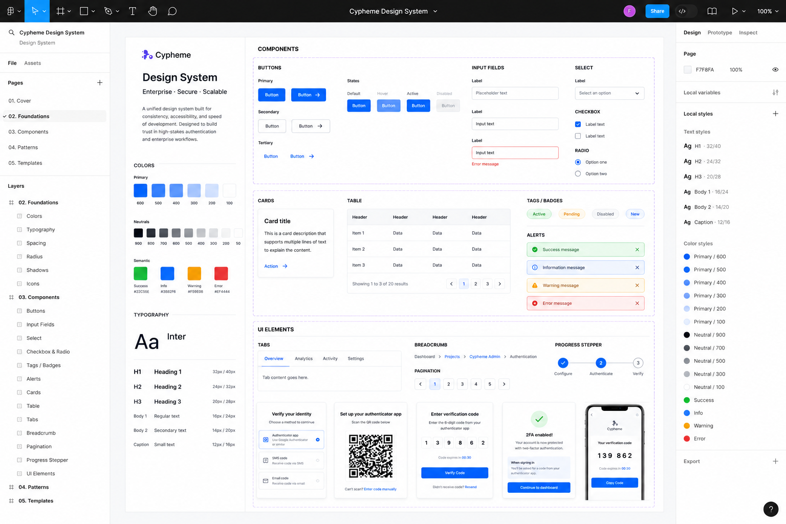
Design System & Scalability
The redesign introduced reusable interface patterns for dashboards, KPI cards, tables, filters, form groups, authentication states, landing page blocks, mobile previews, and navigation structures.
This created a scalable foundation that could support future features, multilingual content, expanding analytics, and more complex enterprise workflows.
Product Constraints
The redesign had to respect existing backend structures, legacy workflows, and platform logic already connected to real enterprise use cases.
Instead of rebuilding the product from scratch, the work focused on progressive modernization: improving usability, interface clarity, and scalability while preserving operational continuity.
- Existing backend and legacy architecture limitations
- Non-technical admin users
- Multilingual content requirements
- Security and authentication expectations
- Responsive customer-facing verification pages
- Growing analytics and reporting complexity
Outcome
The redesign transformed the platform from a legacy admin interface into a clearer, more scalable, and more enterprise-ready SaaS experience.
The updated system improved analytics visibility, reduced visual complexity, strengthened authentication workflows, and created a more confident foundation for future product growth.
The result was a platform experience that felt more trustworthy, structured, and ready for enterprise scale.